/ Brand
Black. Red. Cream.
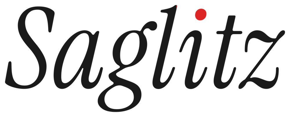
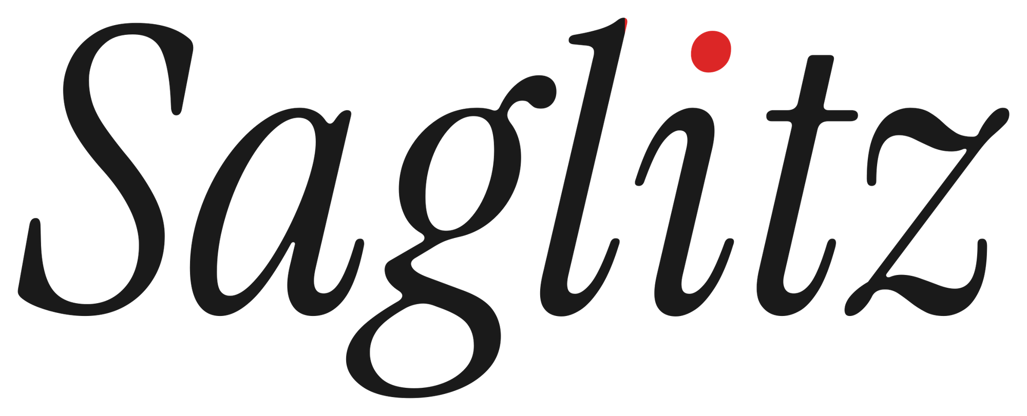
The Saglitz identity on one board: the wordmark and its mark, the chrome, the type, the palette, and how they are used.
Everything here is rendered from the live site's own tokens and typefaces — it is the system, not a picture of it. Click a swatch to copy its hex.
©
01 · WordmarkInstrument Serif Italic

12
02 · Mark12 apps live
03 · ChromePills · dots · toggle
Tagline · Bebas Neue
Sensors in streetsPixels in pocketMade by one
Made by one. Shipped to many.
04 · Voice
Title / ItalicPrimary typography
Instrument SerifGeist · Geist Mono
Bebas Neue
Bebas Neue
05 · Type
PaletteClick to copy
06 · ColourOKLCH in source · hex here
Saglitz
@saglitz
Made by one. Shipped to many. iOS, macOS and smart-city work from Karlsruhe.
saglitz.com
07 · SocialProfile card
08 · UseRules · assets
- 01The i-dot is the only bright red. Any other red surface is the oxblood block.
- 02Instrument Serif is italic or absent. The roman cut never appears.
- 03Labels are Geist Mono at 10px, tracked 0.22em, uppercase. Always.
- 04Bebas Neue carries chapter titles and mantras, nothing smaller.
- 05Dark is the default. Cream is the block's partner, not a second theme.
/ Why a board
A brand that lives only inside a product is easy to bend one decision at a time. Putting it on one page — the mark next to the palette next to the chrome — makes the system visible, and a visible system is one you can keep. It is also the page to send when someone asks for the logo.
The design knowledge behind it